Account Executives (Sales) Business Development Reps (Sales)
ABOUT THE CLIENT
An international B2B SaaS company, selling various subscription and per-transaction services to restaurants.
Challenges
Working together, Account Executives and Business Development Reps work Leads until they are qualified as an Opportunity.
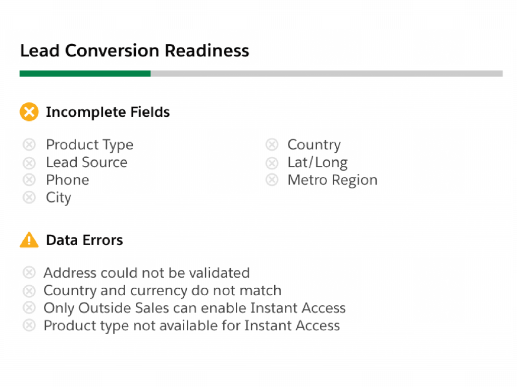
A common pain point through the lead-to-opportunity process is that, due in part to multiple people entering Lead data, there is confusion as to when all of the appropriate data has been entered and the Lead is ready to convert. This is exacerbated by the fact that there are many fields on the Lead object that are not required to convert.
Any time someone would try to convert a Lead without all of the proper information entered, they ended up getting an error toast message showing incomplete fields or failed validations. This led to rework and stalling the sales process.
Approach
Interviewing stakeholders and Sales end users, it became clear that getting Leads ready to convert to Opportunities would have to remain a team effort. Additionally, the non-required fields were useful and should stay on the record. So while I couldn’t lower the number of affordances to the user, I could find a way to improve the experience.
This video follows a Lead from creation to being conversion-ready. The component is responsive, allowing admins to choose where on the page layout to place it. This is why it is shown twice in this demo.
Solution
I replaced the “reactive” error message with a “proactive” dynamic checklist. By placing the component on the page, users always know what’s left to be done.
As fields are filled out and validations marked successful those items disappear from the list and a progress bar advances, allowing the user to focus on remaining tasks. Once the Lead is ready to convert, the checklist is replaced with a branded success message and visual.
Project Notes
I tested a version of the checklist where completed items got checked off rather than disappearing from the list. While users liked the feedback mechanism of list items being checked off as tasks were completed, it took focus away from what was left to do. This approach would work better in an app where users would want to more closely review previously completed tasks. The addition of the progress bar also helps show how much work has already been completed.
The main themes of this project were proactive feedback and gamification. With data entry-heavy tasks, users benefit from an interface that shows their progress or helps answer “what’s in it for me?”.